

PACKAGING DESIGN
-
○ Brand Identity
○ Packaging Design
○ Photography
-
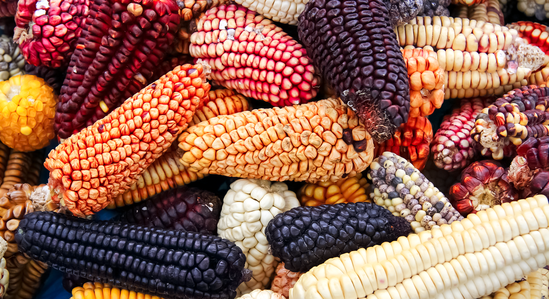
For this packaging design project, I created a Heirloom Seed Company based out of Northern California. The project started with extensive research on the history and importance of heirloom seeds, as well as deciding what seed varieties I would be focusing on. I chose to focus on heirloom corn seeds, and wanted to showcase their vibrant, unique colors in my design. I designed and constructed six primary packages for the six seed varieties, and a secondary packaging that would hold them all. My design is meant to carry an organic feel, and is constructed from quality materials, as our targeted audience was DINK (Double Income No Kids).
Programs used: Adobe Illustrator

BRANDING
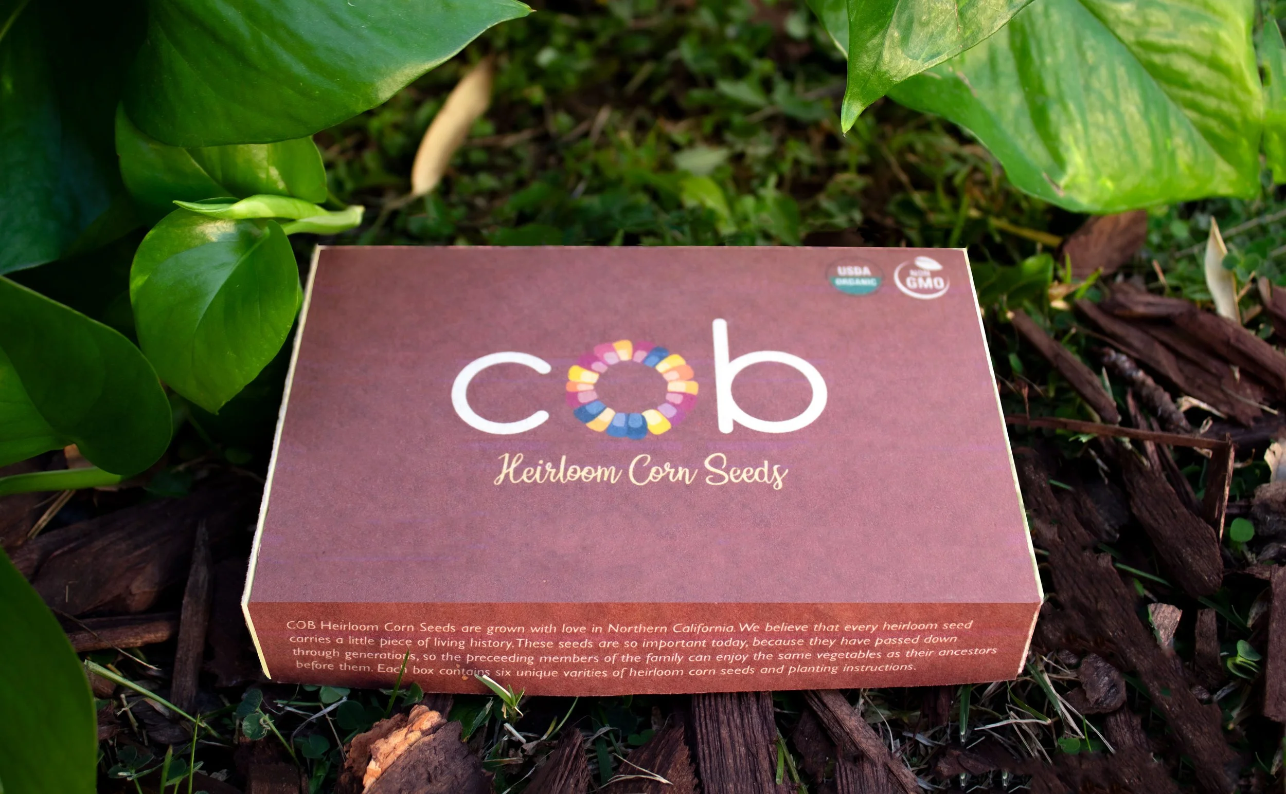
The graphic element of my primary logo emphasizes the cob of the corn, as well as the bright colors of heirloom corn varieties. The illustration effectively communicates the product and is easily recognizable. For my font choices I paired a simple sans serif with a handwritten font to further showcase the organic, natural vibe of the product.


The secondary packaging has softer, earth tones, accenting the variety of corn seed colors through the logo abstract mark. The names of all of the different seed types contained in the box are listed on the sides of the outer packaging.

When lined up inside of the outer container, the primary packages align to create a continuous illustration. I chose to design a landscape of rolling hills and crops for the primary packaging, to speak to the history and disciplined farming behind heirloom seeds.

FORM AND FUNCTION
Both primary and secondary packaging were designed out of lightweight quality cardboard. The primary packaging is secured with a simple folded latch and two flaps. It is secure yet easy to open, and can hold excess seeds if you decide to not plant them all at once. All primary seed containers have a brief description of the type of corn, planting and growing instructions, and the amount of seeds in each package.
