


MOBILE APP DESIGN
-
○ Brand Identity
○ UI/UX Design
○ Illustration
○ Photography
-
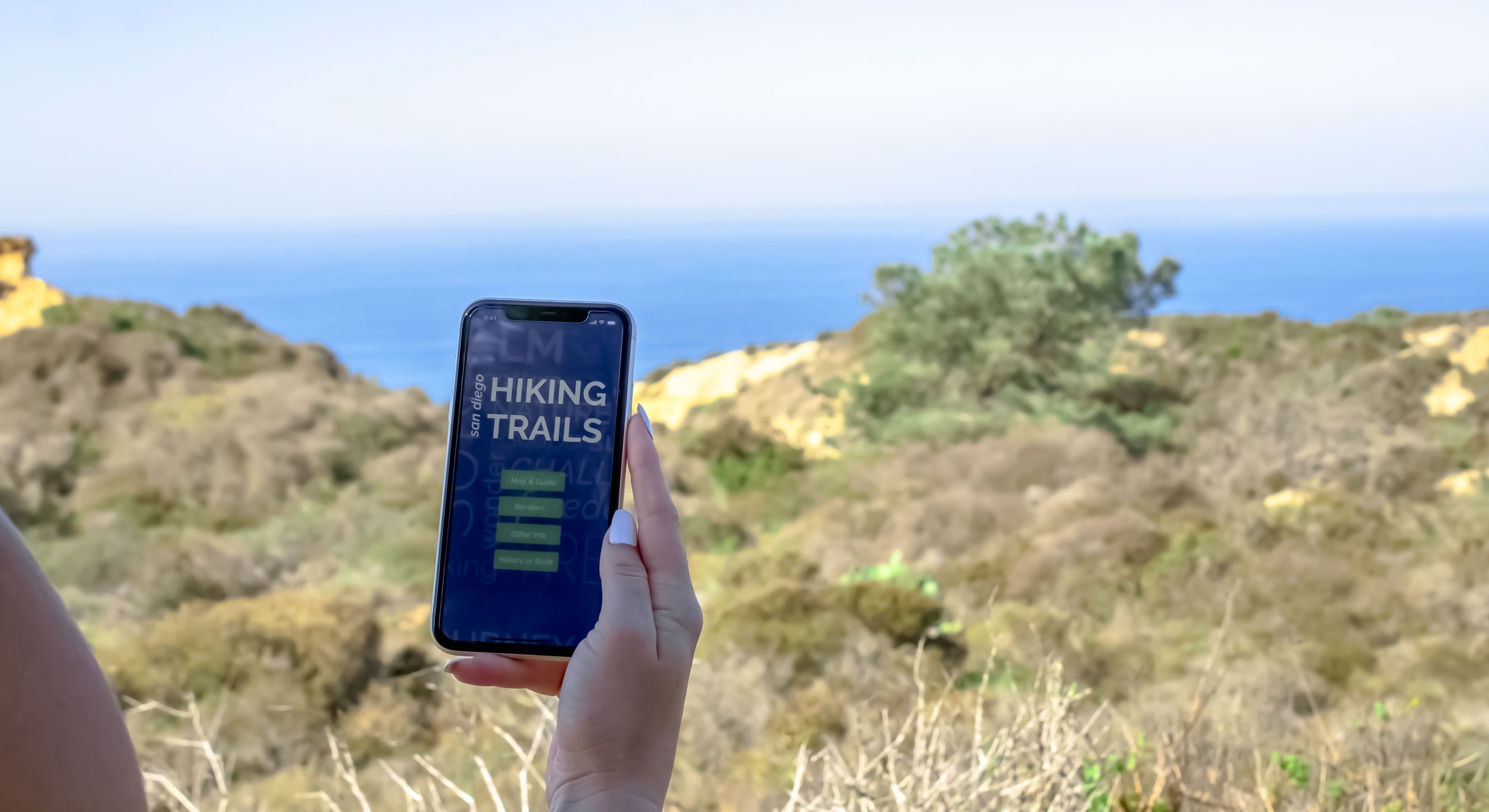
The objective of this passion project is to create a mobile app prototype for a chosen topic, taking notice of communication issues as well as the target audience and context. My topic explores the ten best hiking trails in San Diego, targeting young adults and families. Yelp reviews are used as the main emphasis. My goal for the guide was to be simple and colorful, while being playful with icons and layouts.
Programs used: InVision Studio (prototype); Adobe Illustrator

COLOR PALETTE & ICONS
I chose a color palette that I feel represented the scenery of colors in San Diego nature. I related specifically to the blue of the ocean and the sky, greenery, and tans and browns of the beaches and rocks.
These icons were drawn digitally in Illustrator, and were designed to match the color palette, overall fun and simplistic feel of the passion guide, and supplement the descriptive text of the hike. They also effectively communicate the difficulty of your hike and what to bring with you.


On the right you can view a short walkthrough of my final prototype.
To explore the full interactive prototype, click here.

WIREFRAME

